
Captain & Krewe
The Client
Captain & Krewe is a seafood and raw bar restaurant, a small business located near the heavily-traveled 5th Avenue in downtown Naples, FL.
The Project
This small business was looking for help with print advertisements for their restaurant to appear in a local travel guide. They needed multiple ad sizes and print-ready files, but also some help writing the copy. With my variety of skills, I worked with the owners and was able to create for them what they needed and within specifications for the producers of the guidebook.
What I Did
- Layout
- Visual design
- Photo editing
- Typography & color
- Preparing design files for printing
How it Went
The client for this project needed print advertisements in two different sized options. One half-page and also a version as a one-third page ad. They had already a logo and some professional photos of the food and restaurant. What they did not yet have was any direction for the ads themselves. I worked with them to come up with ads that were concise, but with an aesthetic that was clean and appealing like their restaurant space.
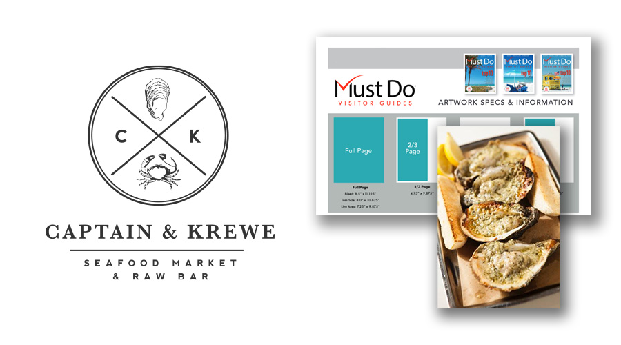
The client already had a very strong logo and branding, giving me a good starting position for this project. Armed with some professional photos and specifications for the guidebook, I was ready to work.
Before beginning with the design itself, I met with the owners to hammer out the text elements for the ad. These ads were going to be using the two smallest sizes available. I had to work with them to distill the copy down to what was absolutely necessary and would be able to be digested quickly by the viewer. We put the emphasis on their convenient location, quality, and reputation.
Once that was agreed upon I created a first pass of mockups of the half-page version of the creative. This format would be getting printed first with the smaller versions to appear in a later edition of the guidebook. I started here knowing that the design of the half-page would inform how the smaller versions would look later on.
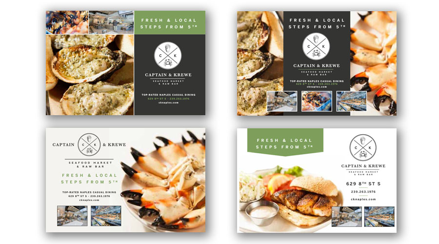
I created a variety of mockups for the half-page advertisement. Their logo treatment and colors were already established as part of their brand. With the copy decided, it was a matter of figuring out what sort of layout the clients would find appealing. Along with which photos they wanted to give prominence.
The clients gravitated towards the clean look of the fourth version of the advertisement. Highlights being the top chevron shape that helped the largest copy stand out. It also acted as a directional device. It would guide the viewer's gaze towards the large food image that they wanted front-and-center while still leaving enough space to feature additional photos. From there it was just a matter of massaging the design's color and layout until the clients were satisfied.
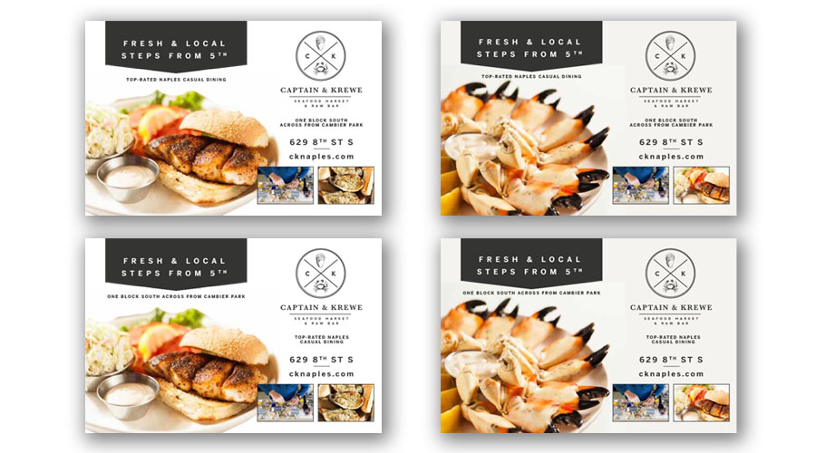
Developing the layout of the ad further from the version chosen by the clients during the previous round. From there I worked with them on the placement of elements and which photos to feature.
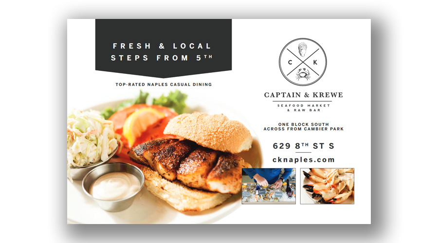
The final version of the half-page advertisement.
After the clients approved the half-page advertisement, I used it as a basis for two one-third page versions. These would be going into a later edition of the guidebook. Here I changed up the main photos at their request. While most of the design process from the start involved typography and layout, I also did some minor photo editing throughout. This brought everything together seamlessly and I made sure the colors of the food popped.
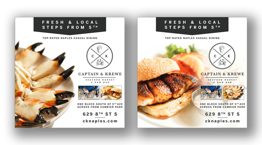
Two versions of the one-third page ad creative.
My Takeaways
I find working directly with clients on projects is always valuable. Especially on this, as it offered me a chance to help a small business that would not otherwise be able to create professional-quality marketing materials alone. Creatively, it was satisfying in that I got to lead the art direction for the entire ad, from the copy to the visuals.
With a relatively tight amount of space, this project got me to think about how I can convey information efficiently and clearly to a viewer while maintaining an overall balance of the graphical elements. I'm pleased to have delivered something that the clients were happy with. This was a case of them not knowing exactly what they wanted, but they would know it when they see it.